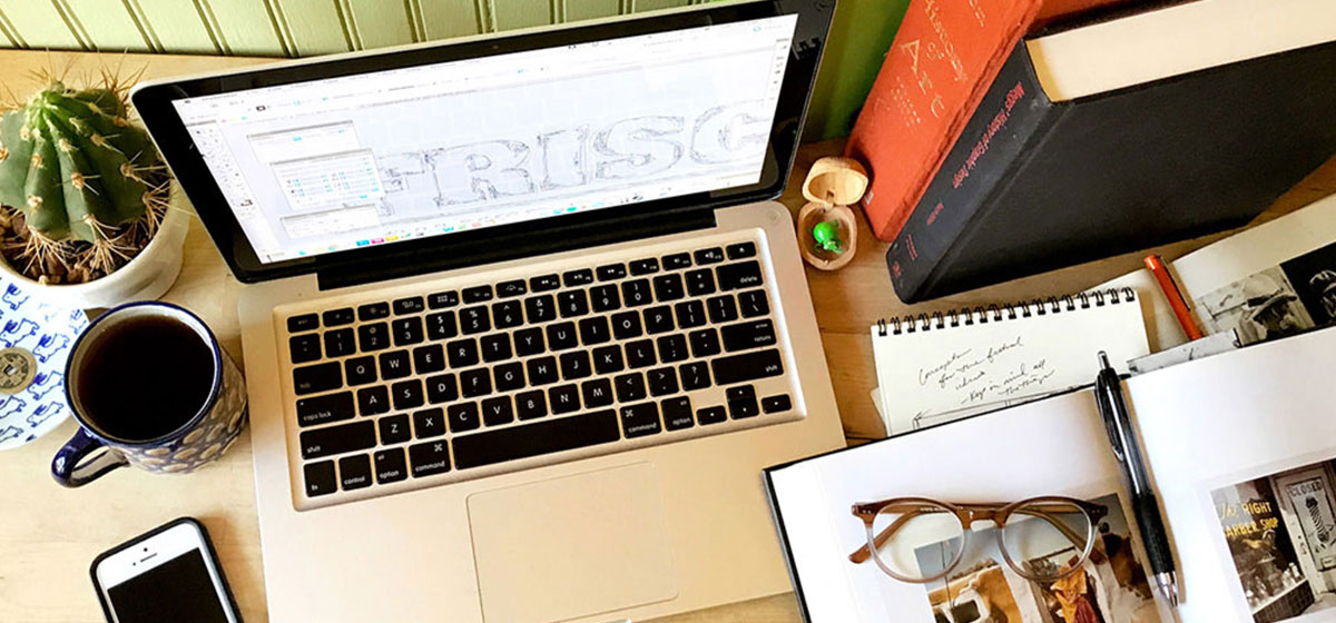
Professional design focused on reaching your objectives
Design is a process we work through together. We’ll keep it as fun as possible while making sure we stay focused on your stated goals. Our job is not just to make you look great; it’s about increasing your leads, generating more phone calls, as well as more customers walking through your door.
MUSEUM OF DANISH AMERICA
BRANDING | EDITORIAL LAYOUT | EXHIBITIONS
AMERICA LETTER
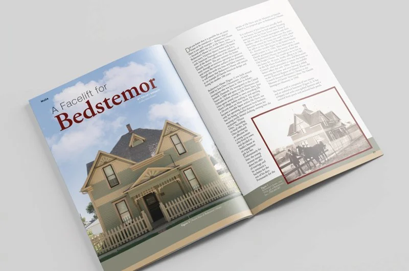
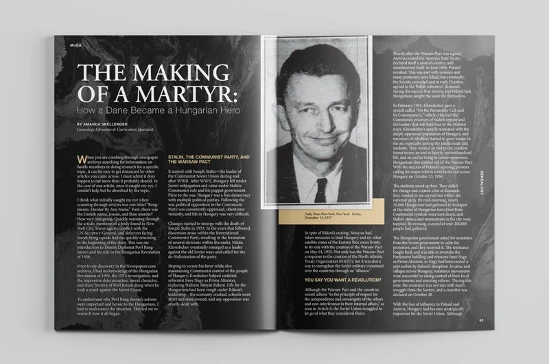
One of the many ways The Museum of Danish America celebrates ‘Danish Roots and American Dreams’ was with their seasonal publication of the America Letter. Roo Bea Design Co. is honored to have created the layouts for the final two editions of this informative and interesting magazine which celebrates Danish heritage and culture. However, with the 40th anniversary of the museum approaching, staff had something new in mind…
MoDA MAGAZINE
MoDA Magazine is the new and improved America Letter! Roo Bea Design Co. paid homage to the original America Letter when creating the new branding and design elements for this publication. MoDA Magazine’s full-color pages beautifully illustrate the immigrant stories and articles that fill each edition. The Museum of Danish America debuted this new version as part of their year-long celebrations commemorating their 40th anniversary!
You can view full editions of both the America Letter and MoDA Magazine as they become available here!
Layouts by Roo Bea Design Co. include Summer 2022, Fall 2022, Spring 2023, Fall 2023, Spring 2024, and Fall 2024.
NATURE-CULTURE / NATUR-KULTUR
In addition to editorial design and layout for MoDA Magazine, Roo Bea Design Co. also contributes to full exhibitions featured at the Museum of Danish America. Work for the exhibit Nature-Culture/Natur-Kultur included logo design and consistent branding to tie together a series of 25 didactics. Care was taken to ensure that the content was approachable, easy to consume, and enjoyable to experience. This exhibit which explores the intersection of Danish cultural values and environmental actions was on display at the museum in 2024.
To supplement this exhibition, Roo Bea Design Co. designed a series of seven pop-up banners specific to bicycling. These traveling banners discuss the history of cycling, current bike culture, and more.
CARROLL COUNTY CONSERVATION
SIGNAGE | PRINT
The designers at Roo Bea Design Co. are passionate about nature and outdoor recreation. This signage project with Carroll County Conservation was a wonderful opportunity to design for some of our favorite subjects! First, we created a map showing the layout of the campground and park features. A large sign was produced for their outdoor kiosk as well as printable handouts for individual visitor reference. While visiting the park keep an eye out for a series of educational signs featured at each of their animal exhibits.
ROTARY ROADS
PRINT | WEBSITE
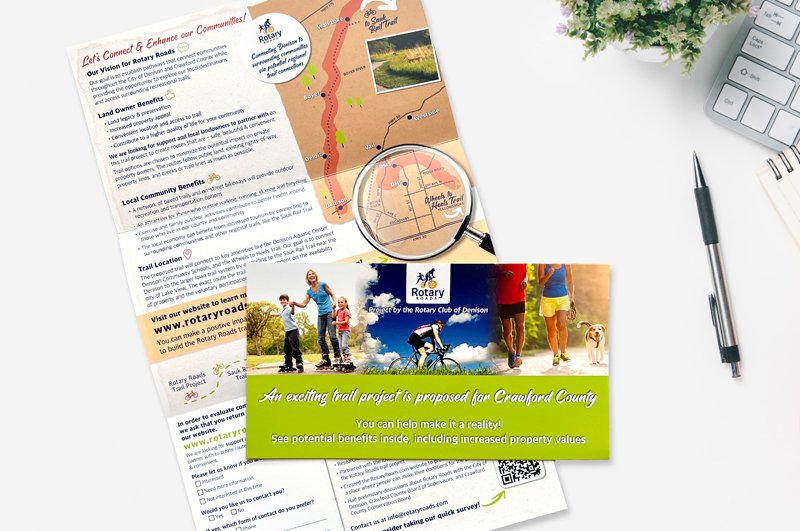
The local Rotary Club in Denison, Iowa is in the process of planning for a trail system that will connect the town to other recreational trails in the state. Roo Bea Design Co. helped gather community support through a bulk mailing and website project. The print piece was designed to be eye-catching, sticking out amongst the clutter of bills and other offers often received via the postal service. The website details the project further and includes an interactive map showing the proposed trail routes. Check it out at rotaryroads.com!
GETAWAY TRAVEL
BRAND IDENTITY | PRINT | SOCIAL MEDIA | AD DESIGN
This client took a chance and followed her dreams! An avid traveler herself, Angela bought the local travel agency after the previous owner retired. She was looking for a fresh start and branding that expressed the joy she hoped to share through travel. Roo Bea Design Co. created a bright, tropical-inspired vibe for her company, Getaway Travel. We have helped Getaway Travel take off through social media graphics and local advertisements while maintaining a consistently fun brand throughout all print pieces.
SIMPLY CHIC
BRAND IDENTITY | PRINT
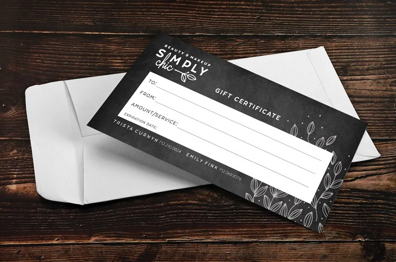
Simply Chic is the official stylist for half of the Roo Bea Design Co. team! We’ve watched as she branched out on her own, opened a salon on her acreage, and now, as she continues to grow her services and offerings. We were there for the rebranding of the business and have enjoyed expanding on it over the years. Post-it Note style appointment “cards”, service handouts, and gift certificates are a few of the pieces we have created for this team of beauty experts.
OVO’S CUISINE
BRAND IDENTITY | PRINT | SIGNAGE
Our first international client comes from sunny and warm Nicaragua! Ovo’s Cuisine was formed from this couple’s shared love of cooking. Their restaurant focuses on breakfast and quick meals made with local ingredients and their unique take on Nicaraguan favorites. Roo Bea Design Co. worked with the pair to create a logo that they were then able to use locally for their signage needs. The coordinating menu placed their items right at the customers’ fingertips.
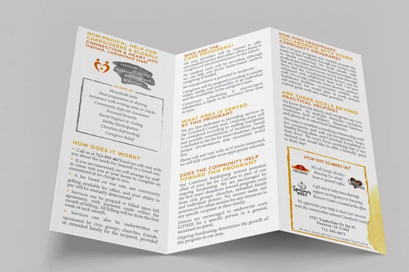
CROSSROADS OF CRAWFORD COUNTY
BRAND IDENTITY | PRINT | SOCIAL MEDIA
This non-profit outreach helps communities with an array of complex and emotionally-charged issues, which can be a challenge to convey in concise messaging. When Crossroads approached us, they had a handful of marketing materials, but none of them looked like they were from the same organization. We went back to the foundation and started with a professional identity makeover that would help unify all materials. Since then, we’ve worked together on several inspiring campaigns and initiatives to grow donors and clients.
“Meriah is an excellent choice for graphic design. She works until you are happy with the result, is reasonably priced and very organized!”
THE SPARROW’S NEST
BRAND IDENTITY | PRINT | SOCIAL MEDIA | ONLINE STORE
The Sparrow’s Nest is a means for Crossroads of Crawford County to serve those in need in our community. Their on-site boutique sells an assortment of items, and they use these proceeds to offset the expenses needed to run the non-profit organization. Roo Bea Design Co. was a natural choice for this group when it came to branding their new store. In addition to creating an identity, I also provide ongoing print material and help run the new online store, which now offers their goods to a broader audience.
HEALTHY EFFICIENT HOMES
MARKETING | PRINT
This developer and builder had big plans to bring more homes to our growing community. He was seeking a cohesive way to inform the public, city officials and potential investors about this opportunity. Roo Bea Design Co. provided Healthy Efficient Homes with a clean and easily understood booklet. The 18-page booklet showcases their many home plans as well as covering the specifics of the build, location, timeline and projected investment returns.
“When I wanted some promotional material Meriah did a great job!”
CARROLL TIMES HERALD
AD DESIGN | PRINT
This local newspaper has been supplying regional and national news to Carroll, Iowa and surrounding communities for over 150 years. The Carroll Times Herald hired Roo Bea Design Co. as a contract ad designer with a focus on special sections and political ads. Thousands of advertisements later, including the Reader’s Choice Best of Carroll County Awards, the Nick Nurse special section, and a masthead makeover, Roo Bea Design Co. feels fortunate to have partnered with such an established company.
Meriah of Roo Bea Design Co. was nominated as the Iowa Newspaper Association's 2020 Best Ad Designer by the Carroll Times Herald and was awarded second place in their class. Her many Nick Nurse ads were awarded first place in the special sections category as well!
“Meriah has designed well over $2 million in advertising for newspapers and web platforms with which I’m involved. Bottom line, I can sell my clients on products branded with her design work. It’s just that simple. Use her artwork and bring in more business.”
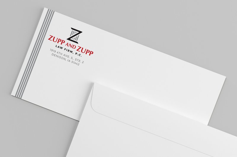
ZUPP AND ZUPP
BRAND IDENTITY | PRINT
The twin attorneys in this local law firm were looking for a refresh. Roo Bea Design Co. focused on creating a brand identity that spoke to their shared mission of serving their community. Once a professional look with a bit of flash was established we then outfitted them with all of the branded products necessary to conduct business. We love how the business and appointment cards, note pads, and stationary items including envelopes and letterhead all turned out!
VINTAGE BEEF
BRAND IDENTITY | WEBSITE | PRINT
Roo Bea Design Co. was recommended to Vintage Beef by a previous client. They had big ideas and were looking to take their family farm’s business to the next level. This meant they were also ready to upgrade their homemade logo and website. We worked with the Gress family to create an identity that expressed their values as high-quality beef producers with a focus on family and farm life. We then created a website with e-commerce capabilities to bring it all together. Gress Family Farms is now selling Country Living branded apparel in addition to their numerous beef products.
THE BOUTIQUE
BRAND IDENTITY | PRINT | SIGNAGE | SOCIAL MEDIA
When the current storeowner took over an already existing consignment and home decor shop she needed a new look for the business. Roo Bea Design Co. created an inviting, feminine identity for the boutique and then built on the brand by creating business cards, social media graphics, and storefront signage - all before their grand re-opening.
“When I bought my business and needed to rebrand, she worked very well with taking my very basic thoughts, creating my beautiful logo and business cards. She’s generous with her time and talents. Very reasonable!”
WESTERN IOWA JOURNALISM FOUNDATION
WEBSITE | PRINT
This foundation was created out of a desire to keep local newspapers alive and vibrant. Roo Bea Design Co. was able to take their provided logo and create a brand identity based on the organization’s needs. A website sharing their mission with the option to donate was first on the agenda. We later created several stationery pieces including Thank You cards to show appreciation for all of the support the foundation has received since the website went live.
JEN PELLANT
BRAND IDENTITY | WEBSITE | PRINT
Jen Pellant was a candidate for the 2020 Iowa House of Representatives elections and had been referred to Roo Bea Design Co. when she required complete branding for her political campaign. We took the time to map out her focus and how to best reach citizens in her district. Based on Jen’s objectives, Roo Bea Design Co. was able to create a logo and identity for Jen that would provide a clear and consistent message to her constituents. Jen Pellant was able to spread awareness of her campaign through a new website and various print pieces.
“Meriah is not just a talented artist and designer, but she really LISTENS. She listens to you when you talk to her about what you envision for your project or your brand and is able to use her artistry to bring your vision to life.”
MARKET IN THE PARK
BRAND IDENTITY | PRINT | SOCIAL MEDIA
This brand new farmers market hit the ground running and was an instant hit with the local community. Roo Bea Design Co. teamed up with the Market in the Park committee to supply them with a fresh logo and brand identity. Thanks to an informative and fun social media presence, the market received many shares and likes, which resulted in a family-filled park. The use of flyers, advertisements, and easy-to-use forms helped the market to continue to grow throughout the entire season.
WAX & RELAX
BRAND IDENTITY | PRINT
We get it - starting your own business is an overwhelming experience. Often times your brand identity is one of the last things you have time for. However, how you visually represent yourself is one of the best ways to make a great first impression. Roo Bea Design Co. was excited to team up with Wax & Relax as they put the finishing touches on their new spa. We really love the soft muted business cards!
LAMBDA THETA NU SORORITY, INC
PRINT | DIGITAL | SOCIAL MEDIA
When the Latina-empowering sorority of Lambda Theta Nu was looking to bring new life to their annual conference, they hired Roo Bea Design Co. to create the entire suite of event materials for their annual conference (NLODC) in El Paso. From the main theme to all the details (agenda, social media graphics, name tags, etc.), their event materials were cohesive, professional, and inspiring across the board.
Roo Bea Design Co. is proud to have designed their conference materials for the fifth year in a row.
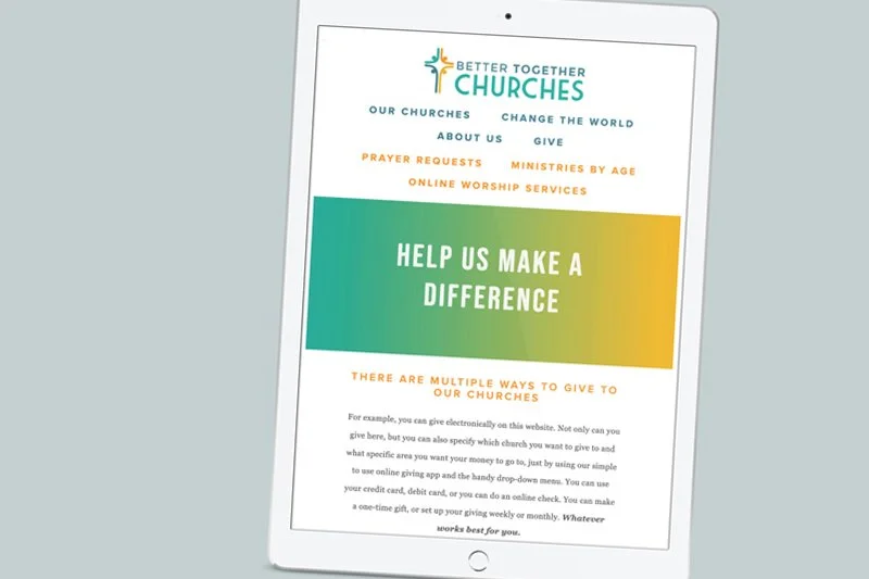
BETTER TOGETHER CHURCHES
BRAND IDENTITY | WEBSITE
A collection of rural Iowa churches found strength in numbers by forming the group, Better Together Churches. The new group needed an identity and more importantly - a way to reach their congregations. Roo Bea Design Co. assisted by first creating their logo and branding. Afterwards, we created a website to perform many important tasks for the churches. Their website keeps the community connected with upcoming events and online worship services. Members are also able to learn about the many ways to volunteer and donate - all online.
IOWA POLITICAL MERCURY
BRAND IDENTITY | BLOG WEBSITE | SOCIAL MEDIA
An area newspaper writer and columnist approached Roo Bea Design Co. in need of a website for their blog. The previous outlet for Iowa Political Mercury was not gaining much traction and did not provide the advertising opportunities they required. We started by creating an identity for the blog, which focuses on the temperature of politics in Iowa, specifically. By applying these concepts to a clean and easy-to-navigate blog, while pairing it with a new Twitter account, the client was able to better share the political views of Iowans online.
“Meriah Blakley and her design agency are first-rate. The artwork is creative and eye-catching and her responsiveness when called with assignments and other work is second to none.”
BLOOM WILD
BRAND IDENTITY | PACKAGING | SIGNAGE
After adding numerous products and working with other designers, Bloom Wild realized their packaging greatly lacked cohesion across the full product line. We worked with Vanessa to introduce a unifying image that was more identifiable on the shelf and stood out amongst retail clutter. From signage to packaging, Bloom Wild now had a more engaging presence. In addition, we worked together to create flexible packaging for items that had seasonally changing scents or ingredients by creating labels with space for handwriting as a meaningful part of the design.
BASS PRO SHOPS
APPAREL DESIGN
For years, Meriah’s designs were featured in Bass Pro Shops locations across the country. She designed for numerous garments and contributed to entire lines of clothing, such as the infant “onesie” line pictured above. These designs require finding inventive (and cute!) ways to express the great outdoors in unexpected ways. She also designed the location-specific merchandise for their stores in Memphis, TN, and Springfield, MO. Her “Born to Hunt” design was a staple in their kids’ section for several years.
SILVER LININGS CLOTHING BOUTIQUE
BRAND IDENTITY | PRINT | SIGNAGE
This small boutique recruited Roo Bea Design Co.’s assistance to transition from an online-only store to their first brick-and-mortar location. Many projects were initiated on a startup-sized budget to make a stunning entrance into the physical retail space: logo design, storefront graphics, flyers & more.
“When I began my business I gave her several ideas on what I wanted my logo to represent. She came up with ideas and designs quickly. I am very happy with her services and would recommend her to anyone.”


